
FUKUSHIMA 11/3/11
Position of Japan on globe:
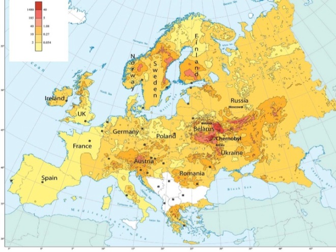
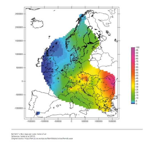
Gobal deposition of Cesium-137 during the first 80 days:

More maps showing the global distribution of radioactive materials released from Fukushima Daiichi nuclear power plant here:
Click to access acp-14-4607-2014.pdf
.
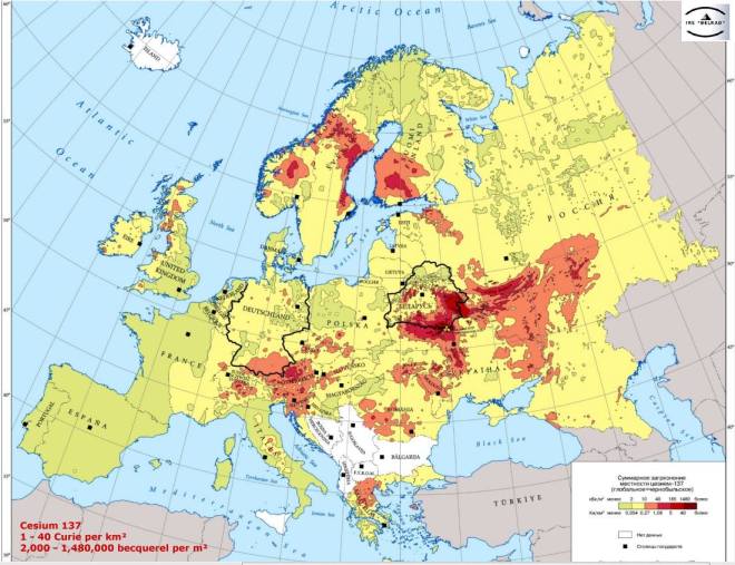
Map from 2012 which gives an indication of the extent of the radioactive contamination by gamma-emitting materials such as Cesium-137 and Cesium-134 at that time:
However, this map does not show the spread of other radionuclides which emit alpha radiation, such as Plutonium-239, and beta radiation such as Strontium-90, which are particularly hazardous when lodged inside the body when inhaled or ingested.
Nor does this map accurately represent the contamination today, in March 2016, as radioactive materials continue to be emitted by the Fukushima Daiichi nuclear power plant via air and water, while winds, rain, snow, ocean waves, rivers, animals, vehicles, ‘decontamintation’ and incineration of radioactive waste will continue to re-distribute and spread it further, as discussed by ROBERT JACOBS in “The Broken Maps of Fukushima”:

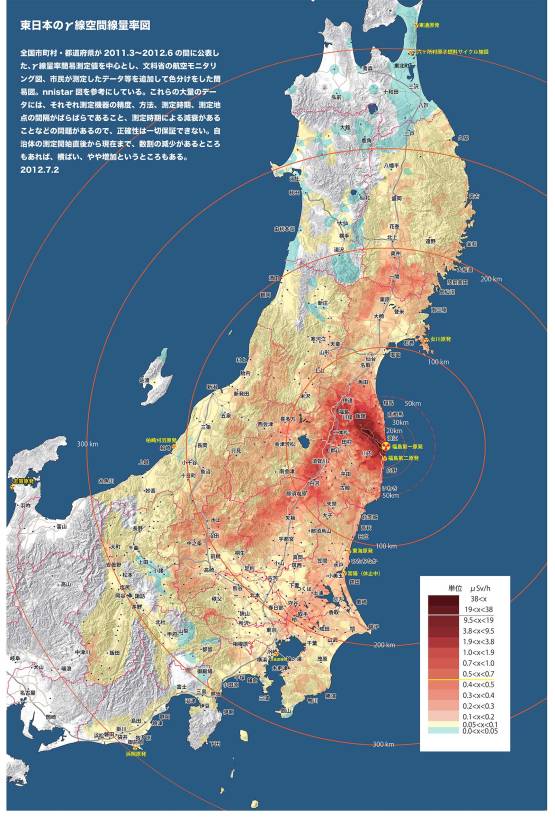
Bo Jacobs re how the contamination maps become innacurate or ‘broken’ because contamination is further spread around by rain, snow, wind, floods, incineration of radioactive waste, animals and more: http://www.dianuke.org/broken-maps-fukushima/
Minna no Data Site: Combined Database of Independent Radioactivity Measurement Labs
Map of Japan using citizens radiation measurements:
http://www.minnanods.net/soil/pref17_colored/map17.html
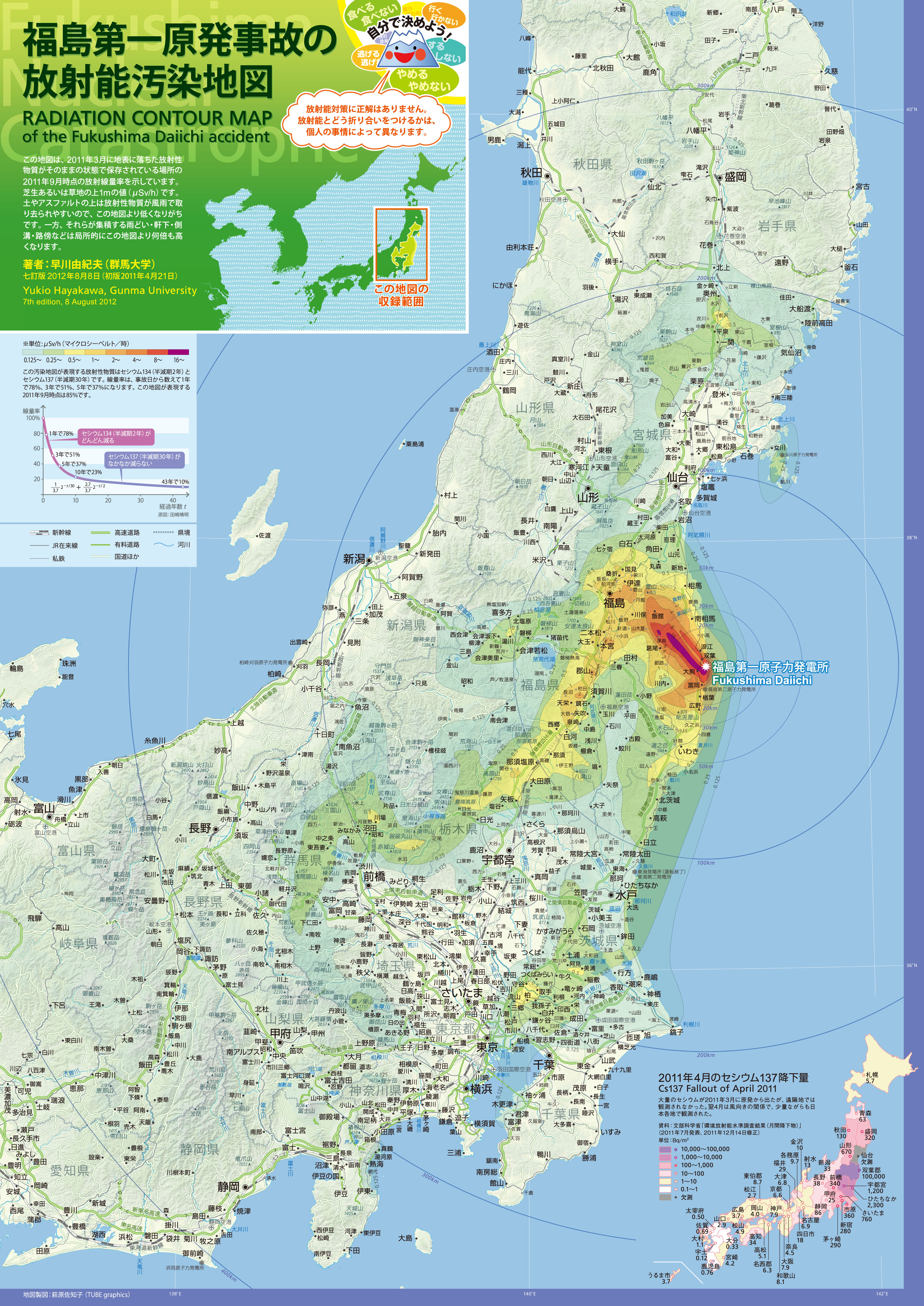
Professor Yukio Hayakawa’s Radiation Contour Map of the Fukushima I Nuke Plant Accident, Ver 7, 2011:
Front page(pdf 5.5MB、jpg 3.3MB)
Back page (pdf 8.7MB、jpg 2.7MB)


dispersal of I131 over entire northern hemisphere by 7 April 2011:

http://openarchive.enea.it/bitstream/handle/10840/4952/1-s2.0-S1352231014004555-main.pdf?sequence=1
.
if there was an accident like the one at Fukushima Daiichi at San Onofre nuclear power plant (NPP) in Southern California, it might look like this:

Like Fukushima Daiichi NPP, San Onofre NPP also sits on a fault line …
and if there was an accident like the one at Fukushima Daiichi at Indian Point nuclear power plant (NPP) in New York state, it might look like this:

CHERNOBYL, Ukraine, (formerly USSR) 26 April 1986


contamination of part of Russia in 1986. This south western area, highlighted on the green map in the top right-hand corner, shares borders with both Belarus and Ukraine.

contamination of the same part of Russia twenty years later, in 2006:

contamination of the south eastern part of Belarus in 2006:

projection of contamination of the same part of Belarus ten years later, in 2016:

more radioactive contamination maps of Belarus here:
http://chornobyl.in.ua/karta-belorussii.html
.
maps showing spread radioactivity in UK from a nuclear accident like Chernobyl:
.
2012 map showing spread of Iodine-131 from Chernobyl over Europe in May 1986 – nb the high concentration in Austria:
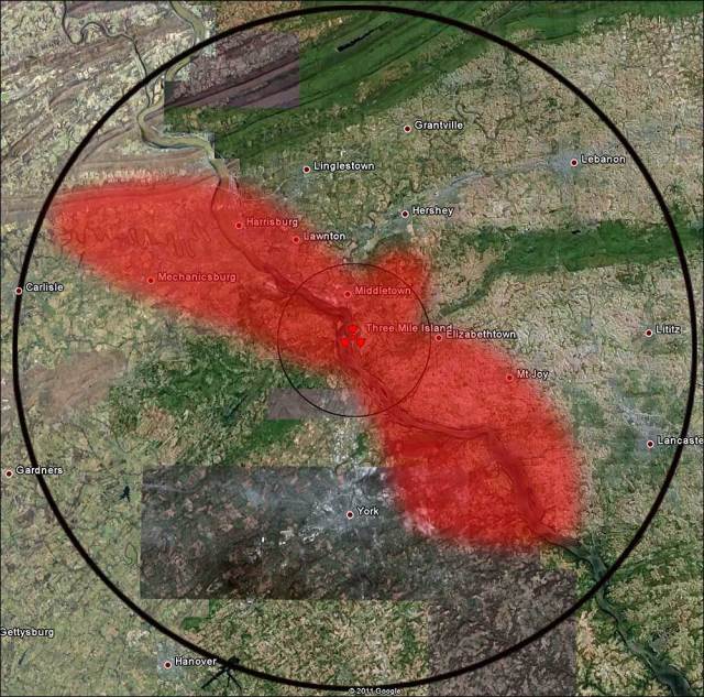
Three Mile Island (TMI), Dauphin County, Pennsylvania, USA, March 28, 1979
The circle indicates a ten-mile radius around TMI nuclear power plant:
Windscale, Cumbria, England, 10 October 1957

Kyshtym, Mayak, Russia (formerly USSR) 29 September 1957

By Jan Rieke, maps-for-free.com; Minimap: NordNordWest, Historicair, Bourrichon, Insider, Kneiphof [GFDL (http://www.gnu.org/copyleft/fdl.html) or CC BY-SA 3.0 (http://creativecommons.org/licenses/by-sa/3.0)%5D, via Wikimedia Commons
Antineutrino glow concentrated around nuclear power plants:
“Nuclear power plants, including the 58 in France, stand out like pimples. Reactors are the only source of human-made antineutrinos, which are created during fission”.
ANTINEUTRINO RAINBOW A global map of antineutrino emissions illustrates that many of the wispy particles are released from Earth’s crust and nuclear reactors:

Map: S.M. USMAN, G.R. JOCHER, S.T. DYE, W.F. MCDONOUGH, J.G. LEARNED, ADAPTED BY S. EGTS
.

thank you for the informative diagrams and maps, crucial for my studies
LikeLike
Please, make a correction: the “top right-hand corner” is not a part of Belarus, but a region of Russia https://fukushima2015.files.wordpress.com/2015/02/319043_html_m707672d8.jpg
LikeLike
Thank you for pointing out this error. It has now been corrected.
LikeLike